Planes dominate our skies. According to some estimates there are about 100,000 flights, everyday (about 25% of which are flown by low-cost airlines). Where trains were once the best ways to travel 700km, many are now choosing to fly instead.
But long-distance train travel has seen a recent explosion in many countries with the growth of high-speed rail networks. Bullet trains were once only associated with Japan (they have been operating in the country since 1964!). Though today high-speed trains are much common across the world.
As high-speed rail networks grow, as does their viability to compete with equivalent plane routes. China Southern Airlines, China’s largest airline, expects the construction of China’s high-speed railway network, the largest in the world by a large margin, to impact (through increased competition and falling revenues) 25% of its route network in the coming years.
But how do the two forms of transport currently stack up around the world?
Methodology
Train and plane routes used for comparison were selected to test the following statement on the “High-speed rail” Wikipedia page:
“High-speed rail (HSR) is best suited for journeys of 1 to 4½ hours (about 150–900 km or 93–559 mi)”. For trips under about 700 km (430 mi), the process of checking in and going through airport security, as well as traveling to and from the airport, makes the total air journey time equal to or slower than HSR. European authorities treat HSR as competitive with passenger air for HSR trips under 4½ hours.”
I chose 5 well trafficked routes of varying distances above and below 700km from places where both air and rail transport is common: Beijing – Shanghai (1318km), Madrid to Barcelona (621km), London to Paris (492km), Tokyo to Osaka (515km), and Paris to Lyon (409km).
Note, the absence of any US cities. Whilst I did some brief research on potential routes in the country, I could find none that posed a current threat to the massive low-cost airline market. Things are changing though.
For train ticket data for journey costs and time I used Seat61 (25/05/2016).
Using data from Skyscanner I collected flight schedules for each route to obtain the fastest flying time between airports. I also used Skyscanner to search for the cheapest possible fares available during the month of September for comparison (25/05/2016).
To estimate carbon emissions for journeys on each mode of transport I used data from the Aviation Environmental Federation.

Download graph.
In order to calculate emissions I needed actual journey distance. Train track length is freely available for the routes I selected. Unfortunately, planes never take an exact route due to weather conditions, delays, air traffic, etc. Because of this I used point-to-point distance between airports. As a result, figures used are less than average actual distances flown.
Results
Speed overview
| Model |
Type |
Max operating speed (train) / cruise ground speed (plane) km/h |
| Boeing 777-200LR |
Plane |
1037 |
| Boeing 707-320 |
Plane |
963 |
| Lockheed L-1011-1 |
Plane |
963 |
| Sukhoi Superjet 100-95 |
Plane |
954 |
| Tupolev Tu-414A |
Plane |
950 |
| Boeing 777-200ER |
Plane |
948 |
| Airbus A350-1000 XWB |
Plane |
945 |
| Airbus A350-900 XWB |
Plane |
945 |
| Airbus A350-800 XWB |
Plane |
945 |
| Boeing 777-300 |
Plane |
945 |
| Airbus A380-800 |
Plane |
945 |
| Airbus A350-1000 |
Plane |
945 |
| Shanghai Maglev |
Train |
431 |
| Harmony CRH 380A, |
Train |
380 |
| AGV Italo |
Train |
360 |
| Siemens Velaro E/AVS 103 |
Train |
350 |
| Talgo 350 |
Train |
350 |
| E5 Series Shinkansen Hayabusa |
Train |
320 |
| Alstom Euroduplex |
Train |
320 |
| SNCF TGV Duplex |
Train |
320 |
| ETR 500 Frecciarossa Train |
Train |
300 |
| THSR 700T |
Train |
300 |
Full table.
This table shows the fastest planes and trains currently operating commercially.
Most modern aircraft cruising speeds are just below 1,000 km per hour. The Boeing 777-200LR is the only commercial airliner that has a cruising speed above this figure at 1,037 km/h – about 200 km/h slower than the speed of sound (MACH 1 = 1,236 km/h). The 777s speed is probably one of the reasons it is used on many of the longest non-stop commercial routes.
Did you know? Concorde had an average cruising speed of 2,140 km/h.
The world record for the fastest train belongs to Mitsubishi L0 Series maglev. A speed of 603 km/h was achieved on a test track in April 2015. Whilst world records help push innovation, the sad fact is actual operating speeds for the travelling public are much slower.
The Shanghai Maglev, the fastest train in operation today reaches a max speed of 431 km/h in just over 3 mins 20 secs (it has reached a non-commercial speed of 501 km/h). You won’t be travelling that fast for long, the track is only 30km long and the fastest scheduled journey time to cover the distance is 7 mins 20 secs. The line was designed to connect Shanghai’s Pudong airport to the outskirts of the city so that passengers can quickly connect to metro lines.
The 9 other fastest trains in operation travel at speeds between 300 – 380 km/h. The 10th fastest airliner has a cruise speed of 945 km/h — over 3 times faster than the slowest train.
Journey Times

Download graph.
Whilst planes can take more direct routes, stations are usually much more time efficient for passengers. Stations are often found in the middle of cities with great transport links. Take Paris, for example. Charles Du Gaulle Airport is a 29km car journey to the centre of the city. Gare Du Nord is walkable to many hotels in the city.
Check-in times are also much more lenient at stations. Whilst you might need to arrive at the airport 2-3 hours before departure, some international train journeys advise you to arrive 45 mins before departure — a potential time saving of over 2 hours.
Given this, lets assume additional travel time for air travel is +150 minutes and +60 minutes for rail.

Download graph.
Even taking these factors into consideration, travel times, in most cases, are tipped in favour of the plane for three of these five journeys. Notably all three journeys are below the 900 km / 270 min estimates described as the maximum distance high-speed trains could compete well with air travel.
In China, travelling by plane between Beijing and Shanghai (1077 km by plane, 1318 km by train) could save you over one hour in travel time compared to the train (285 min by plane, 348 min by train).
There is no difference in time (225 min) between each mode of transport on the Madrid to Barcelona route (483 km by plane, 621 km by train) suggesting the optimum distance for high-speed train travel versus plane might be slightly less than 900km / 270 min.
Of course these are very crude assumptions as my adjustments do not take into account accurate door-to-door journey time for each city which can vary enormously.
Did you know? You’ll save the most time taking the Eurostar from London to Paris saving 50 minutes compared to flying.
Average Speeds

Download chart.
It is interesting to compare average speed to top speed of the train serving the route.
The Beijing – Shanghai route average speed for the journey is only 25 km/h slower than the top speed (275 km/h vs. 300 km/h). The trains are operating close to their allowed safe maximum throughout the route (all 1077 km!).
On other routes the difference between average and maximum is greater. The Eurostar Paris – London route is the second best for speed efficiency (300 km/h vs. 256 km/h). Compare that to the Paris to Lyon route 300 km/h vs. 187.33 km/h — average being almost 40% slower.
Journey Cost

Download graph.
I didn’t realise just how expensive riding the bullet train was in Japan. A fare between Tokyo and Osaka will cost you at best, $124 USD. The cheapest airfare between the two cities is 63% cheaper (about $80 USD — $124 – $46) — a difference that would make most leisure travellers think twice. Interestingly it is only the third longest journey of those analysed (463 km by plane / 515 km by train), resulting in a high-cost per km.
For the other four routes there was very little in cost difference between the cheapest tickets. The second greatest ticket cost difference was on the Paris to Lyon route where air travellers could make savings of about $25 USD.
It’s worth noting you’ll also avoid additional charges often imposed by budget carriers on short-haul routes by choosing the train. The train journeys analysed have no additional charges for personal luggage.
Journey Emissions
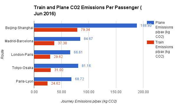
Download graph.
According to the Aviation Environmental Federation trains emit 2.5 times less CO2 per passenger than planes (based on optimum fuel efficiency for both modes of transport).
Planes use the most fuel, and produce the most harmful emissions, during takeoff. On short flights, as much as 25 percent of the total fuel consumed is used at this time. The most fuel-efficient route length for airlines is 4,300 km, roughly a flight from Europe to the U.S. East Coast. About 45 percent of all flights in the European Union (and 80% of the routes analysed in this post) cover less than 500 km.
Based on these figures for the journeys analysed it is clear how much more polluting planes are per passenger when compared to trains.
Did you know? Between Beijing and China 100kg more CO2 per passenger will be emitted on plane journeys when compared to a train journey (plane = 188.80 kg/CO2, train = 79.34 kg/CO2).
Summary
| Route |
Plane Distance (km) |
Train Distance (km) |
Is train faster? |
Is train cheaper? |
Plane cost / time |
Train time / cost |
| Beijing-Shanghai |
1077 |
1318 |
-18.10% |
4.94% |
0.30 |
0.23 |
| Madrid-Barcelona |
483 |
621 |
0.00% |
27.78% |
0.20 |
0.16 |
| London-Paris |
380 |
492 |
28.57% |
38.10% |
0.26 |
0.24 |
| Tokyo-Osaka |
463 |
515 |
12.68% |
-62.90% |
0.19 |
0.58 |
| Paris-Lyon |
392 |
409 |
9.95% |
-31.25% |
0.26 |
0.42 |
See calculations.
Improvements
Clearly more routes could be used for comparison. 5 routes is too small of a sample size to provide any conclusive findings.
I’d also be interested to obtain passenger load statistics (number of seats occupied for each journey) to improve emissions figures. Although emissions are far less of a concern to consumers, if at all, compared to journey price and time.
Comfort is also a big consideration for travellers. Being able to obtain quantative data-points on passenger comfort would add another variable to base a conclusion on.
tl;dr
- Trains are faster for journeys up to 620km (track distance). You’ll save the most time taking the Eurostar from London to Paris saving 50 minutes compared to flying.
- Costs are very sensitive to locale (not distance) for train travel, less so for air travel. In some geographies, for example Tokyo to Osaka (515km by train), you can save over $80 USD when taking the train. Whereas taking the Eurostar from London to Paris you’ll pay $16 USD more for the privilidge. Though these figures do not take into account additional baggage charges often imposed on air travellers.
Acknowledgements
Get the Data


