26 Percent Of All Commercial Airliners are Boeing 737s

New planes like A380s, 787s, or if you’re really lucky, an A350, are great to fly on.

If you fly regularly, switching between old and new planes can make the differences in comfort seem even more acute. It’s not surprising frequent travellers often book flights based on planes serving the route.

But what planes dominate the sky? And how old are they?

Methodology

I began by analysing airlines from Skytrax top 100 airlines 2015.

Using these 100 airlines, I then scraped data from Airfleets that documents every plane flown by each airline (April 2016).

Results

Aircraft flown by airlines

count of aircraft by airline top 10

Download chart.

New planes are expensive. A new 787-8 costs between $157-167MM USD. Owning or leasing a plane is a significant cost on any balance sheet.

Unsurprisingly, older airlines typically have larger fleets.

Did you know? The airlines with the most planes in their fleet are all American: 3. United Airlines (717), 2. Delta Airline (833), 1. American Airline (943).

Most common manufacturers

count of aircraft by manufacturer

Download chart.

Of the planes operated by the Skytrax top 100 airlines (12841), 5872 (45.73%) are built by Airbus and 5880 (45.78%) by Boeing – a difference of just 8 planes!

The other manufacturers have about an 8% share of the market (1089) — Embraer is the third largest manufacture of planes in operation (418 / 3.26%).

Aircraft in operation

age since aircraft introduced vs count in operation top 10

Download chart.

Rank by count Model Mfg Count of model Age since introduction (years) Percentage of total
1 737 Boeing 3337 34.45 25.99%
2 320 Airbus 2498 20.02 19.45%
3 777 Boeing 1131 15.62 8.81%
4 330 Airbus 1000 15.91 7.79%
5 321 Airbus 936 20.02 7.29%
6 319 Airbus 933 20.02 7.27%
7 170 – 195 Embraer 412 8.65 3.21%
8 767 Boeing 369 24.71 2.87%
9 757 Boeing 330 23.80 2.57%
10 747 Boeing 309 33.05 2.41%

Full ranking.

The most common models in operation are the Airbus 320 (19.5% / 2498 planes flying) and Boeing 737 (26% / 3337). They were first introduced 20 and 34 years ago respectively.

The Boeing 747 has long been the workhorse of the commercial airline industry (1543 orders, 1520 delivered). It is still commonly used by airlines (309 in operation / 2.41% market share) and some of these planes are over 20 years old (the 747-100 was first introduced in 1970, although none of these are still in service). Boeing has introduced newer iterations of the aircraft over the years, the most recent of which was the 747-8 in 2011 (although the model has received few orders).

Compare that to Boeing’s newer 787 that has started to see an uptake in orders. The planes first commercial flight was in 2011 operated by ANA. That makes it just over 3 years old. That said, although the plane might have better entertainment systems and a smoother ride (boasting “Smoother Ride Technology”), comfort in economy class on the 787 has received a significant amount of bad press.

Did you know? The most common models of planes in operation are: 3. Airbus A330 (7.79% market share / 1000 planes flying), 2. Airbus 320 (19.5% / 2498), 1. Boeing 737 (26% / 3337).

Airline fleets

The youngest plane in operation, the A350, is the only aircraft less then 1 year old. There are just 18 of these planes currently flying commercially. Finnair has 4, Qatar Airways 8, TAM Airline 2, and Vietnam Airlines 4. Only the BEA Avro RJ100 (12), Airbus A310 (9), and Embraer 135 – 145 (6) are less common — and these are all planes approaching retirement.

Did you know? All of Southwest Airlines fleet is made up of Boeing 737s — that’s 710 planes. Only American Airlines (830 total / 269 are 737s) and United Airlines (717 / 311) have bigger fleets.

Full matrix.

Improvements

Instead of just comparing aircraft models, it would be useful to consider model variations (i.e Boeing 747-400 vs. 747-8). This way the age of fleet could be better considered.

tl;dr

The most common aircraft model in operation is the Boeing 737 (26% market share / 3337 planes) and was first introduced in 1968.

Footnotes

  1. Data sources + data used in this post.

Go To Bangladesh And Never See Another Tourist

We’ve all been on holiday and complained there are too many tourists (the British, anyway).

I once read London was France’s 6th largest city. The Costa Del Sol on the Spain’s Southern Coast is a mecca for 300,000+ Brits seeking the sun each year.

Terms like tourist trap are now common among holiday makers. Though an increasing number of us are actively seeking to avoid such traps. Whole industries have sprung up around holidays “off-the-beaten-track”.

But where are the places with the fewest tourists numbers vs locals?

Methodology

Every year the UN World Tourism Organisation publishes a report titled “Tourism Highlights“. For this post I used the 2015 version (figure reported from 2013). The report contains tourism statistics for 217 countries, including inbound tourist arrivals and receipts. Using this data I was able to identify the countries that report the fewest tourists.

Using population statistics reported by the World Bank for 2013 I was then able to work out the number of inbound tourists compared to the native population of each country.

Analysis

Inbound tourism numbers

number of tourist arrivals 2013 map

Full size map.

top 10 countries with most inbound tourists 2013

Download chart.

10 countries with least inbound tourists 2013

Download chart.

Did you know? The 3 countries that received the most tourists in 2013 were: 1. France (83.6 mil arrivals), 2. United States (69.9), and 3. Spain (60.6).

Did you know? The 3 countries that received the fewest tourists in 2013 were: 191. Kiribati (6000 arrivals), 192. Marshall Islands (5000), 193. Tuvalu (1000).

Populations

population summary map

Full size map.

10 countries with largest populations 2013

Download chart.

10 countries with smallest populations 2013

Download chart.

China and India have a combined population of 2.5 billion. About one-third of the world’s population. India’s population is expected to grow larger than China’s by 2022.

On the other end of the scale Nieu, Montserrat, and the Cook Islands have less than 20,000 native citizens. In total the 10 smallest countries have a combined population of 187,933 people (about the size of Sao Tome and Principe).

Did you know? The 3 countries with the largest populations are: 1. China (1.36 people), 2. India (1.29B), 3. USA (319M). 

Did you know? The 3 countries with the smallest populations are: 214. Tuvalu (9863 people), 215. Montserrat (4900), 216. Niue (1190).

Native Population vs. Tourists

tourist population ratio

Full size map.

Rank Destination Population Tourists (2013) Population – tourist diff Tourist:Population
1 Bangladesh 159,077,513 148,000 158,929,513 1,075
2 Congo, Dem. Rep. 74,877,030 191,000 74,686,030 392
3 Nigeria 177,475,986 600,000 176,875,986 296
4 Guinea 12,275,527 56,000 12,219,527 219
5 India 1,295,291,543 6,968,000 1,288,323,543 186
6 Niger 19,113,728 123,000 18,990,728 155
7 Ethiopia 96,958,732 681,000 96,277,732 142
8 Chad 13,587,053 100,000 13,487,053 136
9 Mali 17,086,022 142,000 16,944,022 120
10 Madagascar 23,571,713 196,000 23,375,713 120

Full ranking.

Bangladesh receives just 1 tourist for every 1075 native Bangladeshis (159M pop / 148K tourists).

Rank Destination Population Tourists (2013) Population – tourist diff Tourist:Population
184 Guam 167,543 1,334,000 -1,166,457 0.13
185 Turks and Caicos Islands 33,740 291,000 -257,260 0.12
186 Monaco 37,623 328,000 -290,377 0.11
187 Aruba 103,441 979,000 -875,559 0.11
188 Cook Is 10,900 121,000 -110,100 0.09
189 St. Maarten 40,917 467,000 -426,083 0.09
190 Brit. Virgin Islands 28,054 366,000 -337,946 0.08
191 St. Martin (French part) 31,530 490,000 -458,470 0.06
192 Macao SAR, China 577,914 14,268,000 -13,690,086 0.04
193 Andorra 72,786 2,328,000 -2,255,214 0.03

Full ranking.

Compare that to Andorra, population 73K, has 2.3 million visitors every year — a difference of about 2.2 million! That’s 1 tourist for every 0.03 of the population. In Macao the difference between population and tourists is 13.69 million (1 tourist:0.04 population).

Improvements

Comparing inbound tourists by nationality would add another dimension to this analysis.

tl;dr

The countries with the fewest tourists compared to native population: 1. Bangladesh (1 tourist: 1075 native population), 2. Democratic Republic of Congo (1:392), 3. Nigeria (1:296).

Footnotes

  1. Data sources + data used in this post.

Greenland Has Grown By Over 20% During The Last 50 Years

“Planting the flag” usually means making a claim to something, usually territory or land.

Throughout history men have “planted the flag” claiming ownership in the name of the king, queen, country, church, etc. marking the land as their own.

If you’re planning to “plant a flag” and claim an area of earth, time is running out. Marie Byrd Land and Bir Tawil Triangle are the only two land areas on Earth not claimed by any country.

The size of a countries land mass can vary for a number of reasons. Historically territorial disputes have seen land won and lost. The biggest risk to a countries land mass in the modern day is the seain some cases threatening a countries very existence.

But which countries have changed the most in size over the past 50 years?

Methodology

I used World Bank data that documents each countries land mass yearly since 1961.

To add additional context I used territorial disputes data found on Wikipedia.

Results

Land mass changes

count of countries that have changed in size

Download chart.

Out of 223 countries, 37 decreased in land mass, 151 had no change and 20 grew.

land mass changes by sq km

Download chart.

Most land mass changes were small +/-1K sq. km — about half the size of Monaco.

Overall, total land mass of all countries shrunk 94K sq. km between 1961 and 2014.

land area changes by country

Full size map.

Growing countries

10 countries that have grown most in land mass

Download chart.

Rank land area % change Country Name Land area diff (sq. km) 1961 – 2014 Land area % of total 1961 – 2014
1 Macao SAR, China 10.30 51.50
2 Greenland 68,750.00 20.12
3 Bahrain 80.00 11.59
4 Singapore 37.00 5.52
5 Hong Kong SAR, China 30.00 2.94
6 Korea, Rep. 1,006.00 1.04
7 Jordan 540.00 0.61
8 Hungary 490.00 0.54
9 Bosnia and Herzegovina 200.00 0.39
10 Uganda 710.00 0.36

Full ranking.

Greenland’s land mass has increased 68,750 sq. km since 1961 — about the size of the Republic of Ireland. According to World Bank records the increase happened between 1996 and 1997 where land mass went from 341,700 sq. km to 410,450 — a 20% increase. I assume this is because of melting ice being officially recorded between these years.

Although Macao grew by only 10.3 sq. km this is a 50% increase in total land mass over the 53 year period.

Shrinking countries

10 countries that have shrunk most in land mass

Download chart.

Rank land area % change Country Name Land area diff (sq. km) 1961 – 2014 Land area % of total 1961 – 2014
199 St. Kitts and Nevis -90.00 -25.71
200 Bhutan -8,606.00 -18.42
201 Ecuador -28,480.00 -10.29
202 Ethiopia -101,000.00 -9.17
203 Vietnam -15,420.00 -4.74
204 Channel Islands -4.00 -2.06
205 Bulgaria -2,070.00 -1.87
206 Seychelles -5.00 -1.09
207 Cuba -951.00 -0.89
208 Macedonia, FYR -210.00 -0.83

Full ranking.

Ethiopia has lost over 100K sq. km of it’s land mass since 1961. The change happened between 1992 and 1993 where land mass went from 1.1M sq. km to 1M — a loss of over 9%!

The list of shrinking countries has 4 small island nations: St Kitts and Nevis, Channel Islands, Seychelles and Cuba. This is probably a result of rising sea levels. St Kitts and Nevis lost over 25% (90 sq. km) of it’s total land mass between 1961 – 2014.

The income factor

land area diff sq km 1961 2014

Download chart.

It is low income areas that will feel the impacts the most from sea level rise as they are the least prepared (lots of settlements on coast, little funding for protection projects, etc.).

The World Bank’s income segmentation highlights how the low and middle income countries are perhaps already suffering land losses as a result.

In total the world lost -34,218 sq. km of reported land mass between 1961 – 2014 — about a 0.07% total loss.

Territorial disputes

count of disputes by countries with more than 5 disputed territories

Download chart.

78 countries have multiple active disputes for land. The US has the most active disputes (13), 6 of which are with Canada.

Did you know? France and Italy still dispute ownership of the Mont Blanc summit

disputed territories by region

Download chart.

In total there are 159 active land disputes across the world.

Improvements

This post offers a very basic look at changing land masses with little context. Significant changes in land mass should be analysed alongside any relevant contextual information – sea level change, conflicts, etc… – to provide information on causation.

tl;dr

Ethiopia has shrunk the most in total land mass between 1961 and 2014 (-101,000 sq.km). St. Kitts and Nevis has shrunk the most as a % of total land mass (-26%).

Footnotes

  1. Data sources + data used in this post.

$100 Per Week To Have Your Airbnb Cleaned in Miami

Airbnb rentals can be a great alternative to hotels, not least because they’re often cheaper.

As the company expands it’s reach into the global tourist market an ever increasing number of cities have hosts making their properties available to rent through the company.

For travellers on a budget the choice of destination is often heavily weighted on cost of accommodation, one of the largest expenditure of any holiday.

So where can you find the cheapest Airbnb rentals?

Methodology

To draw up a list of cities for comparison I turned to GoEuro’s “Accommodation Price Index” published in 2016 (using data from 2014). This list of 150 cities consists of the top tourist destinations chosen based on several factors including hotel availability and size of hospitality industry.

I then turned to Airdna for data on Airbnb rentals. I examined the average nightly cost of “Entire place” studio, one, and two bedroomed rentals on Airbnb (house and apartment) during the month of Feb 2016 (May 2016 for cleaning rates) for the cities collected from GoEuro. Airdna had data for 87 of the 150 cities listed on the Accommodation Price Index.

Many listings on Airbnb are not actively rented. Airdna has defined its own definition of what constitutes an “active” property. I am only considering “active” properties in this post, although admittedly I’m not 100% sure of the definition.

airbnb active rentals feb16

Full map.

Rank (most active rentals) City Active rentals total Feb16
1 London, UK 29718
2 Paris, France 29344
3 New York (Manhattan), USA 16648 (26795 NYC)
4 Rio de Janeiro, Brazil 16057
5 Berlin, Germany 13931
6 Barcelona, Spain 13550
7 Rome, Italy 12383
8 Sydney, Australia 11800

Full ranking.

It is surprising more US cities are not on this list of most active rentals, especially given this was the Airbnb’s first market. It is also surprising to see European cities, London and Paris, in first and second place respectively.

Analysis

Studio price index

Entire Studio House and Apartment Nightly Rental Ave USD Feb16

Download chart.

Studios can be rented as cheaply as $26 USD before fees (St. Petersburg, Russia) although most rentals (58/87) have a nightly cost of between $35 – $75 USD.

Airdna studio rentals Feb16 Map

Full map.

Rank (most expensive) City Entire Studio (House & Apartment) Nightly Rental Ave USD Feb16
1 Manchester, UK 169.50
2 Singapore, Singapore 154.50
3 San Francisco, USA 153.50
85 Mumbai, India 31.50
86 Sarajevo, Bosnia and Herzegovina 29.00
87 St. Petersburg, Russia 26.00

Full ranking.

San Francisco (2nd) and Singapore (3rd) are expensive places to live and as such would be expected to be cities with high rental values.

Manchester in 1st place ($169.50 USD p/night) almost $15 USD more than second placed Singapore ($154.50 USD) is unexpected — not least because rents are on average 63% cheaper in Manchester than London (ranked 9th @ $109.50 USD p/night). My assumption for this would be that there is a greater supply of studios geared to transient populations in London, San Francisco, and Singapore. Whereas in Manchester studios are likely to be of higher specification, more centrally located, and mainly designed for traditional renters. What do you think?

1 bedroom price index

Entire 1BR House and Apartment Nightly Rental Ave USD Feb16

Download chart.

There is a wider spread of prices for one bedroomed apartments compared to studios, perhaps because of more supply (greater choice), although this is just an assumption as Airdna only provides a single aggregated “active” rentals number for all property types.

airdna 1br rentals feb16 map

Full map.

Rank (most expensive) City Entire 1BR (House & Apartment) Nightly Rental Ave USD Feb16
1 San Francisco, USA 172.50
2 Boston, USA 167.50
3 New York (Manhattan), USA 164.50
85 Sochi, Russia 35.00
86 Budapest, Hungary 34.50
87 St. Petersburg, Russia 26.50

Full ranking.

In most cases, one bedroomed properties are around 14% more expensive than studios. What constitutes a studio and a 1 bedroomed is somewhat of a grey area though. I’ve stayed in Airbnb rentals listed as 1 bedroomed that official measures would deem a studio. Frustrating, ever-so-slightly. However, could be one reasons that accounts for this ever-so-slight increase in cost.

2 bedroom price index

Entire 2BR House and Apartment Nightly Rental Ave USD Feb16

Download chart.

Whilst most 2 bedroomed places are below $200 USD p/night before fees, 5 cities have an average above this figure. 2 cities cost more than $300 USD a night, Dubai, UAE ($326.50 USD) and Frankfurt, ($311.50 USD).

airdna 2br rentals feb16 map

Full map.

Rank (most expensive) City Entire 2BR (House & Apartment) Nightly Rental Ave USD Feb16
1 Dubai, UAE 326.50
2 Frankfurt, Germany 311.50
3 Boston, USA 281.50
85 St. Petersburg, Russia 44.00
86 Sochi, Russia 40.50
87 Sarajevo, Bosnia and Herzegovina 38.00

Full ranking.

At the other end of the scale, a 2 bedroomed places in Eastern Europe can be picked up very cheaply. The 10 cheapest cities for 2 bedroomed cities are all in Eastern Europe (all below $60 USD).

Cleaning fee index

Once you’ve got your heart set on a place, don’t forget to budget for the additional fees charged. These include a cleaning fee set by the host, and it’s not always as cheap as you might expect.

Cleaning fees help hosts account for extra expenses they have getting their listing ready before guests arrive or after guests depart.
Airbnb

Ave Cleaning Fee USD May16

Download chart.

You’re probably wondering what city has average cleaning fees that amass on average $100 USD per rental. That city would be Miami, USA.

airdna cleaning fees may16 map

Full map.

Rank (most expensive) City Ave Cleaning Fee USD May16
1 Miami, USA 100.00
2 Boston, USA 95.00
3 Ibiza, Spain 91.00
84 Bucharest, Romania 12.00
84 Sarajevo, Bosnia and Herzegovina 12.00
87 Kiev, Ukraine 10.00

Full ranking.

You might notice that 2 of the top 3 cities with the highest cleaning fees could both be considered “party towns”, Miami and Ibiza. Parties = mess = more cleaning?

Improvements

Whilst this post identifies the most expensive cities in which to rent an Airbnb apartment, it does not look at potential profits hosts can achieve. Or put another way, the differences between cost of ownership or longterm rental against Airbnb income.

tl;dr

The cheapest “Entire place” Airbnb rentals can be found in Eastern Europe. For a studio or 1 bedroomed place go to St. Petersburg, Russia (ave. $26 USD p/night exc. fees), and Sarajevo, Bosnia and Herzegovina for 2 bedroomed places ($38 USD).

Footnotes

  1. Data sources + data used in this post.

It’s Cheaper To Take An Uber To The Airport, And Back

Uber has been fighting continuing battles with major cities and their traditional licensed cab drivers for years now. In some cities this has resulted in legal rulings banning Uber drivers from operating completely.

However it’s not just cities taking aim at the taxi app. Airports are also drawing battle lines with the company in an effort to protect revenues.

The ease of catching a cab is often paramount for weary travellers, but many are still very price-sensitive even after the longest of flights.

But are the costs of Uber rides on fiercely competitive (and regulated) airport journeys cheaper then traditional taxis (as they are in cities)?

Methodology

I was able to calculate fares for Uber journey costs from airports on their website (UK & US) (April 2016).

These could then be compared with traditional taxi fare data available from TfL (UK) and Taxi Fare Finder (UK & US) (April 2016).

The Black Taxi

The Black Taxi an icon of London. In recent years Black Taxi drivers have been losing market share of passengers travelling overground to minicabs (often operated by taxi apps, like Uber). The situation is so bad, TfL (who operate Black Cabs), are struggling to recruit new Black Cab drivers.

Queue a fierce fight between TfL and Uber.

One that almost saw Uber being banned from the British capital altogether in 2015 but for a small technicality about wether the app constituted a taximeter. But technicalities aside; why are consumers switching to taxi apps?

Analysis

Uber Services

Uber vs Black Taxi Journey Costs in London

Download chart.

Service Ave Fare (1 mile) GBP Ave Fare (2 mi) GBP Ave Fare (4 mi) GBP Ave Fare (6 mi) GBP
UberX 5.18 7.25 10.95 15.10
UberX (1.9x surge) 9.83 13.78 20.81 28.69
UberX (2.5x surge) 12.94 18.13 27.38 37.75
UberEXEC 9.25 13.30 20.50 28.60
UberLUX 13.78 20.35 31.85 45.00
UberXL 10.53 13.45 18.85 24.70
Black Taxi (Mon-fri (06:00-20:00)) 7.20 11.20 18.50 26.00
Black Cab (Mon-fri (20:00-22:00), Sat-sun (06:00-22:00)) 7.30 11.50 19.00 30.00

Full table.

UberX rides are generally cheaper than traditional Black Cabs, unless the dreaded surge pricing is in effect.

For example, the more expensive Black Taxi Fare would cost £7.30 GBP to go 1 mile. An UberX would cost only £5.18 GBP. However, during periods of high demand where 1.9x and 2.5x surge pricing is in effect the same journey would cost you £9.83 GBP and £12.94 GBP respectively through Uber — potentially well over twice the price of a Black Taxi.

Uber Services To / From London airports

Registered taxis in London (Hackney Carriages, not necessarily Black Taxis) have strictly regulated fares from its many airport into the city.

Uber vs Taxi cost from airport to Paddington Station, London

Download chart.

London Heathrow (T5) – Paddington St GBP (ave) Gatwick South — Paddington St GBP (ave) Stansted – Paddington St GBP (ave) Luton- Paddington St GBP (ave) City- Paddington St GBP (ave)
uberX 37.00 96.00 74.50 46.50 28.50
uberX (1.9x surge) 55.50 144.00 111.75 69.75 42.75
uberX (2.5x surge) 92.50 240.00 186.25 116.25 71.25
uberXL 56.00 149.50 114.00 89.50 40.00
UberEXEC 71.00 135.50 104.50 82.50 55.00
UberLUX 109.50 283.50 221.50 171.00 88.50
Taxi (Mon-fri (06:00-20:00)) 67.40 125.60 78.80 59.90 40.60

Full table.

Many registered taxis and private hire cars pay surcharges to airports (often passed on to passengers directly). Uber drivers are also liable for such charges.

Even so, UberX rides are considerably cheaper from all London airports — almost £50 GBP cheaper from Gatwick South Terminal to Paddington Station. Only recently did Uber scrap flat fees from London airports which could have potentially made these journeys even cheaper.

Registered taxis sit somewhere between UberX and UberXL services, and are the second cheapest option when compared to the other services Uber offers.

Uber To / From US airports

Lets change colours to the bright yellow of the second most iconic taxi, the New York City Cab (and the less iconic taxis of San Francisco and Chicago). And yes, both these cities have had their disagreements (like the London Black Cabs), to put it lightly, with Uber.

Uber vs Taxi cost from US airport to major landmark

Download chart.

JFK – Grand Central (ave) USD SFO – Market St (low) USD ORD – Chicago Union (ave) USD
uberX 59.00 25.00 33.00
uberXL 88.50 37.00 56.50
UberBLACK 116.50 68.00 88.00
UberSUV 145.50 84.00 111.50
Taxi (Mon-fri (06:00-20:00)) 64.73 64.69 52.45

Full table.

Like London, the UberX service comes out much cheaper than choosing a taxi in all cities. In San Francisco and New York the fares are staggeringly cheaper. In New York UberX services are about $20 USD cheaper, and in San Francisco almost $40 cheaper!

Improvements

Uber operates in 81 countries (Oct 2016). In the US and UK cities considered, UberX is cheaper than traditional taxis to and from airports. I would be interested to learn if the same was true in the 79 other countries.

tl;dr

UberX services from airports are cheaper than registered taxis from airports.

Footnotes

  1. Data sources + data used in this post.

Your Airbnb Rental Is More Spacious, Homely, and CHEAPER Than A Hotel

Airbnb is increasingly becoming an ingrained part of searching for a place to stay when away from home — just look at the companies very rapid growth rate as an indication.

One common belief held by travellers is that an Airbnb rental is usually cheaper than staying at a hotel. A quick glance at the prices shown in GoEuro’s Accommodation Price Index, suggests this statement would appear to hold some weight.

Are Airbnb rentals really cheaper?

Methodology

To draw up a list of cities I turned to GoEuro’s “Accommodation Price Index” published in 2016 (using data from 2014). This list of 150 cities consists of the top tourist destinations chosen based on several factors including hotel availability and size of hospitality industry.

I then turned to Airdna for data on Airbnb rentals. I examined the average nightly cost of “Entire place” studio and one bedroomed rentals on Airbnb (house and apartment) during the month of Feb 2016 for the cities collected from GoEuro. Airdna had data for 87 of the 150 cities. I chose 1 bedroomed and studio rentals as I deemed them the closest equivalent to hotel rooms.

Results

Airbnb vs hotels

USD Difference between hotel and 1 bed, entire home Airbnb rental

Download chart.

USD Difference between hotel and Airbnb map

Download map.

I found Airbnb rentals are on average $7.29 USD cheaper then hotels.

In 26 of the 88 cities I analysed hotels were cheaper, compared to 60 cities where Airbnb’s were cheaper. 2 cities had no price difference, Riga and Warsaw.

USD Difference between hotel and entire home Airbnb rental

Download chart.

40 of the 60 cities that were cheaper for Airbnb rentals, were only slightly cheaper ($0 USD – $15) than hotels.

Top 10 cities where hotels are cheaper (by actual price difference)

Top 10 cities where hotels are cheaper than Airbnbs by price difference

Download chart.

Rank City Hotel-Aibnb diff USD EM Hotel Ave 2014 USD Airdna Median Entire Home Studio 1br Feb16 USD
79 Frankfurt, Germany (13.75) 62.00 75.75
79 Shanghai, China (13.75) 41.00 54.75
81 Boston, USA (14.33) 147.00 161.33
82 Mexico City, Mexico (14.67) 42.00 56.67
83 Reykjavik, Iceland (15.75) 85.00 100.75
84 Chicago, USA (16.75) 97.00 113.75
85 San Francisco, USA (22.00) 141.00 163.00
86 Ibiza, Spain (27.75) 71.00 98.75
87 Manchester, UK (31.25) 100.00 131.25
88 Singapore, Singapore (38.00) 94.00 132.00

Full table.

In the cities where hotels are cheaper, the best savings by choosing a hotel can be found in Singapore ($38 USD cheaper then Airbnb rentals).

Top 10 cities where Airbnb rentals are cheaper (by actual price difference)

Top 10 cities where Airbnbs are cheaper than hotels by price difference

Download chart.

Rank City Hotel-Aibnb diff USD EM Hotel Ave 2014 USD Airdna Median Entire Home Studio 1br Feb16 USD
1 New York, USA 95.50 246.00 150.50
2 Cancùn, Mexico 70.00 134.00 64.00
3 Bruges, Belgium 63.00 131.00 68.00
4 Miami, USA 62.50 167.00 104.50
5 Rio de Janeiro, Brazil 45.00 99.00 54.00
6 Cape Town, South Africa 40.00 99.00 59.00
7 Seoul, South Korea 33.50 85.00 51.50
8 Paris, France 33.25 117.00 83.75
9 Montreal, Canada 30.00 82.00 52.00
10 Venice, Italy 28.50 146.00 117.50

Full table.

In New York you can save on average $95 by choosing an Airbnb over a hotel. The city is a popular with Airbnb hosts with 16648 Active Rentals (3rd highest worldwide). Perhaps an oversupply of rentals is pushing down prices for guests allowing for such a large saving?

Did you know? The cities with the most Active Rentals in February 2016 were: 3. New York (16648), 2. Paris (29344), 1. London (29718).

Price difference between hotels and Airbnb’s by region (by actual price difference)

USD Difference between hotel and Airbnb by region

Download chart.

On a regional level, Airbnb rentals are generally cheaper everywhere. It is interesting to note that savings in Europe, which I would assume to be the companies second largest market, are relatively low ($1.95 USD).

Top 10 cities where hotels are cheaper (by % price difference)

rank (actual price diff) rank (% price diff) City EM Hotel Ave 2014 USD / Airdna Media Entire Home Studio 1br Feb16 USD
84 79 Chicago, USA 85.27%
83 80 Reykjavik, Iceland 84.37%
76 81 Dusseldorf, Germany 83.90%
79 82 Frankfurt, Germany 81.85%
78 83 Rotterdam, Netherlands 81.70%
87 84 Manchester, UK 76.19%
79 85 Shanghai, China 74.89%
82 86 Mexico City, Mexico 74.12%
86 87 Ibiza, Spain 71.90%
88 88 Singapore, Singapore 71.21%

Full table.

When looking at percentage price differences, Singapore hotels are over 28% cheaper than Airbnbs. Singapore also has the largest actual price difference between hotels and Airbnb rentals ($38 USD).

Top 10 cities where Airbnb rentals are cheaper (by % price difference)

rank (actual price diff) rank (% price diff) City EM Hotel Ave 2014 USD / Airdna Media Entire Home Studio 1br Feb16 USD
2 1 Cancùn, Mexico 209.38%
3 2 Bruges, Belgium 192.65%
5 3 Rio de Janeiro, Brazil 183.33%
16 4 St. Petersburg, Russia 170.89%
6 5 Cape Town, South Africa 167.80%
7 6 Seoul, South Korea 165.05%
1 7 New York, USA 163.46%
4 8 Miami, USA 159.81%
9 9 Montreal, Canada 157.69%
14 10 Istanbul, Turkey 151.96%

Full table.

Whilst New York had the largest actual price difference where Airbnbs were $95 USD cheaper (hotels were 63% more expensive than Airbnbs), Cancun has the largest percentage price difference between hotel and Airbnbs (hotels are over 109% more expensive!).

A developing market

A number of savvy Airbnb hosts increase their pricing to match high demand, much like most hotels do. Requiring significant effort by hosts, many have previously missed out on opportunities for increased revenue as a result. Similarly during quieter periods static prices for rentals often leave potential guests looking elsewhere because they are set unusually high for the time of year.

Airbnb’s pricing tool that debuted publicly in November 2015 is likely to remove much of this burden from hosts. It is too early to tell if more dynamic pricing will increase or decrease the cost difference between hotels and Airbnb rentals.

Improvements

Having to use aggregated city data for both hotels and Airbnb rentals is not the best way to compare prices. If I was able to compare specific hotels and Airbnb rentals that were more closely matched (location, quality, etc) would result in higher accuracy of analysis.

tl;dr

Airbnb rentals are typically cheaper than hotels.

Footnotes

  1. Data sources + data used in this post.

You’re Not Worth £20 Million GBP (Of Travel Medical Cover)

The explosion of insurance providers and the baffling array of cover terms they offer are at best frustrating, at worst risk leaving you without valid cover.

One of the most important things to consider is medical cover. In some countries simple medical treatments can be very expensive (I’m calling you out America).

Do most people really need the multi-millions offered by travel insurance companies?

Methodology

I decided to compare travel insurance quotes delivered by Compare The Market using 4 scenarios: trips to the US and EU, comparing standard and winter sports cover.

The trip was proposed for April 17th 2017, for 7 days. I chose a date long into the future so that readers can retrieve the same quotes for analysis. Travel insurance calculations do not seem to be affected by date of travel (I retrieved quotes for a travel date of 17th April 2016 and 2017 and quotes returned were identical).

Travel insurance quotes were provided for 27 year old male with no existing medical conditions.

Medical treatment costs for comparison were taken from a report by AXA (a travel insurance provider).

Results

Count of Quotes

Count of providers and quotes

Download chart.

43 quotes for standard cover (US & EU) seems like a lot to me – but as a customer it’s nice to have some choice so I won’t complain. Providers typically offer 3 different cover levels (i.e Bronze, Silver, Gold) within each cover type.

Cost by Defaqto rating

Average cost of cover by rating

Download chart.

Defaqto is an independent company that provides general ratings for insurance policies designed to show customers:

…where a product or proposition sits in the market, based on the quality and comprehensiveness of the features and benefits it offers.

As expected, policies tend to increase in price as the Defaqto rating increases. Though for US standard cover, you can purchase some 5* policies cheaper than some 3* and 4* policies offered.

Average price difference by rating

Download chart.

For Winter Sports policies there is a large difference between the cheapest and highest premiums. Standard insurance policies have a smaller difference. Choosing a 5* policy over a 2* for US standard cover is, on average, only £3.21 GBP more expensive. Compare that to US Winter Sports Cover where the difference is £44.82 GBP.

Cost of treatment

Average cost of medical treatment

Download chart.

Average cost of treatment map

Download chart.

The charts above shows average of estimated costs for three of the most common health claims abroad: Ear infection, Gastroenteritis, Broken bone following a slip or fall.

The US is by far the most expensive for medical treatment (£15,888) — twice that of the 2nd most expensive, Singapore (£7277). The most expensive place for treatment in Europe is Mainland Greece (£5911).

Bear in mind that these costs are for relatively common misfortunes, and that more serious incidents can lead to eye-wateringly high sums — the cost to be incurred by someone falling off a balcony and seriously injuring themselves in the US, for example, is likely to be in the region of £150,000.

Medical cover limits

Average medical cover provided

Download chart.

Most policies, regardless of their Defaqto rating, offer between £10 – 15 million GBP of cover. Only one policy offers unlimited medical cover.

Even though treatment in Greece is a third of the cost for comparable treatment in the US, medical cover offered by EU and US policies is almost identical.

Medical excess

Average medical excess by rating

Download charts.

That said, it is very unlikely you’ll ever need millions of GBP worth of medical treatment, even whilst skiing where it can cost £75 GBP per-minute flying time to be evacuated from the mountain by helicopter.

If you’re in Europe it’s very likely you will incur relatively low treatment costs — below £5,000 GBP. The cost of treatment is likely to be even less than the policy excess, especially for 2* policies with relatively high excesses (>£150 GBP).

Take 2* and 5* Standard cover in Europe that have average excesses of £188.16 GBP and £35 GBP respectively, a difference of £153.16 GBP. The average premiums for these policies are £11.16 GBP and £20 GBP, a difference of £8.84 GBP. By choosing the 5* policy you could save £144.32 GBP (153.16 – 8.84) on a claim.

Additional factors

Average baggage cover

Download chart.

Average baggage excess by rating

Download chart.

Spending a little extra on an EU Standard policy could increase your baggage cover by as much as £1,500 GBP and reduce any excess you would be required to pay by over £150 GBP.

Though beware. Many travel insurers also put a limit on the payout for individual valuable items, such as cameras and laptops. The limits vary between insurers but are typically either £250 or £500. If someone steals your cash while you are on holiday, the payout is again usually limited to £250 or £500.

Average cancellation cover by rating

Download chart.

Average cancellation excess by rating

Download chart.

Again cover and excesses are much more favourable for customers choosing Defaqto higher rated policies for cancellation cover too.

Cover, excesses, and premiums

Whilst medical cover is similar (£10-15 million GBP) for all policies, regardless of their Defaqto rating; excesses, baggage, and cancellation cover offered are much more attractive the higher the policies rating. And higher rated polices are not significantly more expensive than those with a lower rating. The more expensive US Winter Sports policies have an average difference of £44.82 GBP between 2* and 5* policies — and you will immediately make a saving by choosing the higher rated policy due to lower excesses should you need to make a claim .

All-in-all, medical cover should probably be the least of your considerations when choosing a policy. Reputable providers offer more than adequate cover.

Improvements

With enough time, deconstructing each individual policy for the differences in cover and terms would help in comparing them all (I imagine this task would take a small army to complete). Instead of using broad Defaqto ratings, I could better consider each policy against the other to see which was the most cost effective for requirements.

tl;dr

It’s very rare to need tens of millions worth of medical cover. You should be more concerned with policy excesses.

Footnotes

  1. Data sources + data used in this post.

The Most Common Passport Colours 2016

Passports are beautiful documents. Take a page out of the new UK passport as an example. If you’ve ever taken the time to admire your own passport you will know this — and for the cost, it should be!

Purples, reds, blues, blacks. Coats of arms, flags, intricate typography. Animals, people of distinction, iconic objects. Design elements that often make up the national identity of the country.

Enjoy them, passports as we know them might not be around for too much longer.

But which colours are you most likely to see? And how are colours chosen?

Methodology

The relevant standards for passport design is set by the International Civil Aviation Organization (ICAO) in Document 9303, which sets standards for machine readable travel documents (which includes most government-issued ID cards as well as passports).

The size ID-3 is specified in ISO/IEC 7810. The ICAO standard has a lot to say about security, what photos should look like, what belongs on the data page, etc., but doesn’t restrict the design any further beyond recommending a size.

Countries are completely free to choose the colours of their passports, as evidenced by the fantastic variety of passport designs.

I collected scans of passport covers from PassportIndex.com to analyse. To the best of my knowledge, they are all the most recent versions.

For population statistics I used the most recent figures published by the World Bank (2014).

Analysis

Dominant colours

Passport colour map 2016

Full size map.

Count of passport dominant colours all countries 2016

Download chart.

Examining the dominant colours in passports from all 201 issuing authorities, blue (70) and red (67) are by far the most abundant colours in use today.

Potential passports that could be issued by dominant colour 2016

Download chart.

Adjusting for the total number of passports that could be issued to everyone worldwide, which is very different to actual number of passports issued, things change. In this case, red would be by far the most common passport colour due to its use by highly populated countries like China.

Significance of colour

Passport colour distribution by region 2016

Download chart.

Colours have always held cultural significance in design choices. In many Asian countries red often symbolises good luck, in the US most would associate the colour with anger or danger.

Some regional groups of countries have agreed to use a common design for their passports: Regular EU passports are burgundy red (official and diplomatic passports vary), CARICOM passports are all dark blue (officials green, diplomats red) and show the CARICOM logo.

Swiss passport design

All passport images.

Other countries choose colours familiar from national symbols. For instance, the Swiss passport is bright red, like their flag, and many Islamic countries make their passports green or black.

Improvements

The passport scans I used were not dated. Whilst brief research shows them to be correct, I have my doubts.

Quality of scanned passport covers could also be improved to identify subtle differences in colour. I did attempt to do this with the current scans but the colours calculated seemed inaccurate.

tl;dr

  • The most common passport colour is Blue…
  • .. but if everyone in the world owned a passport the most common colour would be Red.
  • Regional groups of countries have agreed to use a common design for their passports, which is why over 75% of EU passports are red.

Acknowledgements

Get the Data

Checked Bag Prices On Budget Carriers Are Too Cheap

Budget travellers have come to expect the added costs associated with checked bag prices — and are likely to have developed the ability to pack one-weeks worth of clothes into a single carry-on bag.

Though with cabin baggage allowances regularly being reduced, it’s getting harder. Perhaps so-much-so you start wondering how much it would cost to ship some items by courier to your destination.

The concept is nothing new. Over the past few years a number of companies have set out to do just this. Airlines have also entered the space.

How do budget airlines compare with shipping your bag with a courier?

Methodology

Checked bagged costs on European budget carriers were obtained via TravelSupermarket (sourced in March 2016). 16 different products from 11 budget airlines were reported (some airlines offer different price bands based on checked bag weight).

Checked baggage minimum and maximum charges at booking Mar 2016

Download chart.

Europe’s budget airlines are imposing ever more complex prices for placing a bag in the hold. Where flat fees were once the norm, carriers now charge by an array of variables including time of year. Depending on when you fly, Norwegian has the cheapest possible checked bag cost per flight (£7 GBP / 20kg) , whilst Ryanair has most expensive (£45 GBP / 20kg) — that’s £90 GBP for a round-trip!

Given this analysis considers European budget airlines I then drew up a list of European cities to use as destinations for comparison. Cities were selected based on popularity and wether or not they were served by at least one of the budget airlines I collected prices for.

Full list.

Using MyParcelDelivery I then calculated the cost of shipping a suitcase of dimensions 76cm x 48cm x 29cm (a “large” case) with shipping weights of 15kg, 20kg and 25kg on 1, 2 and 3-5 day services from London, UK to this list of destinations.

Results

1 day services from London

Cost to ship 20kg cheapest hold courier 1 day March 2016

Download chart.

Courier companies are arguably more price sensitive to the distance your bag travels — they are not receiving additional revenue for carrying passengers.

That said, couriering a bag from London to the Netherlands (£80.17 GBP / 378.89km) is slightly more expensive than shipping it to Ireland (£79.68 GBP / 589.28km), a country further away by straight-line distance to each countries central point (210.39km).

Bulgaria or Romania, are the most expensive destinations to courier a 20kg bag from London. Using UPS International Express Saver service (1 day) this would cost you £147.30 GBP. Checking this bag at the most expensive Ryanair price would only cost you £45 GBP — a difference of £102.30 GBP.

Out of the 21 courier routes researched, only 5 cost less than £140 GBP to courier a bag in 1 day.

Therefore, airlines could be missing a significant amount of potential revenue by checking your bag instead of using the space to take time-sensitive cargo — you’re actually getting a great deal in comparison.

2 day services from London

Cost to ship 20kg cheapest hold courier 2 day

Download chart.

2 day services using MPD International Export are slightly cheaper than 1 day services as you would expect. However, they are still all more expensive than even the highest price for checking a bag on a budget airline (Ryanair / £45 GPB).

Croatia is the most expensive destination for 2 day services at £135 GBP, only £10 GBP cheaper then a 1 day service (£145.81 GBP).

This time the Netherlands is the cheapest destination to ship to via courier (£82.19 GBP).

Strangely, to ship to Ireland via courier on 2 day services from London will cost £108.47 GBP — more expensive than most central European countries.

3-5 day services from London

Cost to ship 20kg cheapest hold courier 3-5 day

Download chart.

3-5 day courier services are the only ones that compete on price with checking a bag.

Even so, the cheapest checked bag prices on most budget airlines (7) are still lower than the 25 courier routes researched.

Rank Service 3-5 cost courier / checked airline 20kg cheapest GBP
1 Norwegian (20kg) 7.00
2 Jet2 (22kg) 11.00
3 Germanwings (20kg) 11.60
4 Wizzair (23kg) 12.00
4 Aer Lingus EU (20kg) 12.00
6 easyJet (20kg) 13.00
7 Monarch (20kg) 15.00
8 London-France 16.79
9 London-Austria 17.40
10 London-Belgium 17.99
11 Flybe (20kg) 19.00
12 London-Denmark 19.19
12 London-Germany 19.19
12 London-Ireland 19.19
15 London-Poland 20.39
16 London-Netherlands 21.59
16 London-Portugal 21.59
16 London-Spain 21.59
19 Thomson (20kg) 22.00
19 Thomas Cook (20kg) 22.00
21 London-Sweden 22.20
22 London-Hungary 23.99
23 Ryanair (20kg) 25.00
24 London-Switzerland 30.76
25 London-Norway 31.47
26 London-Finland 38.39
27 London-Estonia 43.19
27 London-Latvia 43.19
27 London-Lithuania 43.19
30 London-Croatia 44.27
31 London-Romania 45.49
32 London-Greece 46.79
33 London-Bulgaria 52.79
34 London-Malta 103.19
35 London-Italy 142.86
36 London-Czech Republic 145.81

Full list.

All services

Average cost by service ave courier ave hold

Download chart.

Many argue that checked bag prices are too rigid. On Easyjet you have to pay for a 20kg bag (minimum price £13 GBP), even if your bag weighs less. Though in Europe all courier services I analysed also charged a flat fee to ship 15 – 20 kg from London. Therefore, you won’t make any savings by choosing a courier if your bag weighs slightly less than the max allowance either.

Improvements

The aforementioned door-to-door luggage services offered by some premium and long-haul airlines would not only give both a wider geographic view, but also a comparison between budget and premium airline charges.

tl;dr

  • Checked bag prices are much cheaper than courier companies one or two day shipping services.
  • If you’re prepared to ship your luggage 3-5 days in advance it might be cheaper to use a courier, but most budget airlines will still be cheaper!

Acknowledgements

Get the Data

High-Speed Rail Is Killing Short-Haul Air Travel

Planes dominate our skies. According to some estimates there are about 100,000 flights, everyday (about 25% of which are flown by low-cost airlines). Where trains were once the best ways to travel 700km, many are now choosing to fly instead.

But long-distance train travel has seen a recent explosion in many countries with the growth of high-speed rail networks. Bullet trains were once only associated with Japan (they have been operating in the country since 1964!). Though today high-speed trains are much common across the world.

As high-speed rail networks grow, as does their viability to compete with equivalent plane routes. China Southern Airlines, China’s largest airline, expects the construction of China’s high-speed railway network, the largest in the world by a large margin, to impact (through increased competition and falling revenues) 25% of its route network in the coming years.

But how do the two forms of transport currently stack up around the world?

Methodology

Train and plane routes used for comparison were selected to test the following statement on the “High-speed rail” Wikipedia page:

“High-speed rail (HSR) is best suited for journeys of 1 to 4½ hours (about 150–900 km or 93–559 mi)”. For trips under about 700 km (430 mi), the process of checking in and going through airport security, as well as traveling to and from the airport, makes the total air journey time equal to or slower than HSR. European authorities treat HSR as competitive with passenger air for HSR trips under 4½ hours.”

I chose 5 well trafficked routes of varying distances above and below 700km from places where both air and rail transport is common: Beijing – Shanghai (1318km), Madrid to Barcelona (621km), London to Paris (492km), Tokyo to Osaka (515km), and Paris to Lyon (409km).

Note, the absence of any US cities. Whilst I did some brief research on potential routes in the country, I could find none that posed a current threat to the massive low-cost airline market. Things are changing though.

For train ticket data for journey costs and time I used Seat61 (25/05/2016).

Using data from Skyscanner I collected flight schedules for each route to obtain the fastest flying time between airports. I also used Skyscanner to search for the cheapest possible fares available during the month of September for comparison (25/05/2016).

To estimate carbon emissions for journeys on each mode of transport I used data from the Aviation Environmental Federation.

Train and Plane Route Distance Jun 2016

Download graph.

In order to calculate emissions I needed actual journey distance. Train track length is freely available for the routes I selected. Unfortunately, planes never take an exact route due to weather conditions, delays, air traffic, etc. Because of this I used point-to-point distance between airports. As a result, figures used are less than average actual distances flown.

Results

Speed overview

Model Type Max operating speed (train) / cruise ground speed (plane) km/h
Boeing 777-200LR Plane 1037
Boeing 707-320 Plane 963
Lockheed L-1011-1 Plane 963
Sukhoi Superjet 100-95 Plane 954
Tupolev Tu-414A Plane 950
Boeing 777-200ER Plane 948
Airbus A350-1000 XWB Plane 945
Airbus A350-900 XWB Plane 945
Airbus A350-800 XWB Plane 945
Boeing 777-300 Plane 945
Airbus A380-800 Plane 945
Airbus A350-1000 Plane 945
Shanghai Maglev Train 431
Harmony CRH 380A, Train 380
AGV Italo Train 360
Siemens Velaro E/AVS 103 Train 350
Talgo 350 Train 350
E5 Series Shinkansen Hayabusa Train 320
Alstom Euroduplex Train 320
SNCF TGV Duplex Train 320
ETR 500 Frecciarossa Train Train 300
THSR 700T Train 300

Full table.

This table shows the fastest planes and trains currently operating commercially.

Most modern aircraft cruising speeds are just below 1,000 km per hour. The Boeing 777-200LR is the only commercial airliner that has a cruising speed above this figure at 1,037 km/h – about 200 km/h slower than the speed of sound (MACH 1 = 1,236 km/h). The 777s speed is probably one of the reasons it is used on many of the longest non-stop commercial routes.

Did you know? Concorde had an average cruising speed of 2,140 km/h.

The world record for the fastest train belongs to Mitsubishi L0 Series maglev. A speed of 603 km/h was achieved on a test track in April 2015. Whilst world records help push innovation, the sad fact is actual operating speeds for the travelling public are much slower.

The Shanghai Maglev, the fastest train in operation today reaches a max speed of 431 km/h in just over 3 mins 20 secs (it has reached a non-commercial speed of 501 km/h). You won’t be travelling that fast for long, the track is only 30km long and the fastest scheduled journey time to cover the distance is 7 mins 20 secs. The line was designed to connect Shanghai’s Pudong airport to the outskirts of the city so that passengers can quickly connect to metro lines.

The 9 other fastest trains in operation travel at speeds between 300 – 380 km/h. The 10th fastest airliner has a cruise speed of 945 km/h — over 3 times faster than the slowest train.

Journey Times

Train and Plane Journey Time Jun 2016

Download graph.

Whilst planes can take more direct routes, stations are usually much more time efficient for passengers. Stations are often found in the middle of cities with great transport links. Take Paris, for example. Charles Du Gaulle Airport is a 29km car journey to the centre of the city. Gare Du Nord is walkable to many hotels in the city.

Check-in times are also much more lenient at stations. Whilst you might need to arrive at the airport 2-3 hours before departure, some international train journeys advise you to arrive 45 mins before departure — a potential time saving of over 2 hours.

Given this, lets assume additional travel time for air travel is +150 minutes and  +60 minutes for rail.

Train and Plane Complete Journey Time Adjusted Jun 2016

Download graph.

Even taking these factors into consideration, travel times, in most cases, are tipped in favour of the plane for three of these five journeys. Notably all three journeys are below the 900 km / 270 min estimates described as the maximum distance high-speed trains could compete well with air travel.

In China, travelling by plane between Beijing and Shanghai (1077 km by plane, 1318 km by train) could save you over one hour in travel time compared to the train (285 min by plane, 348 min by train).

There is no difference in time (225 min) between each mode of transport on the Madrid to Barcelona route (483 km by plane, 621 km by train) suggesting the optimum distance for high-speed train travel versus plane might be slightly less than 900km / 270 min.

Of course these are very crude assumptions as my adjustments do not take into account accurate door-to-door journey time for each city which can vary enormously.

Did you know? You’ll save the most time taking the Eurostar from London to Paris saving 50 minutes compared to flying.

Average Speeds

Journey Average Speeds

Download chart.

It is interesting to compare average speed to top speed of the train serving the route.

The Beijing – Shanghai route average speed for the journey is only 25 km/h slower than the top speed (275 km/h vs. 300 km/h). The trains are operating close to their allowed safe maximum throughout the route (all 1077 km!).

On other routes the difference between average and maximum is greater. The Eurostar Paris – London route is the second best for speed efficiency (300 km/h vs. 256 km/h). Compare that to the Paris to Lyon route 300 km/h vs. 187.33 km/h — average being almost 40% slower.

Journey Cost

Train and Plane Journey Cost Jun 2016

Download graph.

I didn’t realise just how expensive riding the bullet train was in Japan. A fare between Tokyo and Osaka will cost you at best, $124 USD. The cheapest airfare between the two cities is 63% cheaper (about $80 USD — $124 – $46) — a difference that would make most leisure travellers think twice. Interestingly it is only the third longest journey of those analysed (463 km by plane / 515 km by train), resulting in a high-cost per km.

For the other four routes there was very little in cost difference between the cheapest tickets. The second greatest ticket cost difference was on the Paris to Lyon route where air travellers could make savings of about $25 USD.

It’s worth noting you’ll also avoid additional charges often imposed by budget carriers on short-haul routes by choosing the train. The train journeys analysed have no additional charges for personal luggage.

Journey Emissions
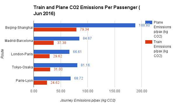
Train and Plane CO2 Emissions Per Passenger Jun 2016

Download graph.

According to the Aviation Environmental Federation trains emit 2.5 times less CO2 per passenger than planes (based on optimum fuel efficiency for both modes of transport).

Planes use the most fuel, and produce the most harmful emissions, during takeoff. On short flights, as much as 25 percent of the total fuel consumed is used at this time. The most fuel-efficient route length for airlines is 4,300 km, roughly a flight from Europe to the U.S. East Coast. About 45 percent of all flights in the European Union (and 80% of the routes analysed in this post) cover less than 500 km.

Based on these figures for the journeys analysed it is clear how much more polluting planes are per passenger when compared to trains.

Did you know? Between Beijing and China 100kg more CO2 per passenger will be emitted on plane journeys when compared to a train journey (plane = 188.80 kg/CO2, train = 79.34 kg/CO2).

Summary

Route Plane Distance (km) Train Distance (km) Is train faster? Is train cheaper? Plane cost / time Train time / cost
Beijing-Shanghai 1077 1318 -18.10% 4.94% 0.30 0.23
Madrid-Barcelona 483 621 0.00% 27.78% 0.20 0.16
London-Paris 380 492 28.57% 38.10% 0.26 0.24
Tokyo-Osaka 463 515 12.68% -62.90% 0.19 0.58
Paris-Lyon 392 409 9.95% -31.25% 0.26 0.42

See calculations.

Improvements

Clearly more routes could be used for comparison. 5 routes is too small of a sample size to provide any conclusive findings.

I’d also be interested to obtain passenger load statistics (number of seats occupied for each journey) to improve emissions figures. Although emissions are far less of a concern to consumers, if at all, compared to journey price and time.

Comfort is also a big consideration for travellers. Being able to obtain quantative data-points on passenger comfort would add another variable to base a conclusion on.

tl;dr

  • Trains are faster for journeys up to 620km (track distance). You’ll save the most time taking the Eurostar from London to Paris saving 50 minutes compared to flying.
  • Costs are very sensitive to locale (not distance) for train travel, less so for air travel. In some geographies, for example Tokyo to Osaka (515km by train), you can save over $80 USD when taking the train. Whereas taking the Eurostar from London to Paris you’ll pay $16 USD more for the privilidge. Though these figures do not take into account additional baggage charges often imposed on air travellers.

Acknowledgements

  • Axlegeeks, who provide lots of interesting statistics about aircraft — I used crusing ground speeds.
  • Wikipedia for a wealth of data on high-speed train travel.
  • Skyscanner, where I collected plane journey data from.
  • Seat61, a site that provided train journey data.
  • and finally… The Aviation Environmental Federation for emissions data.

Get the Data